
eHealth Bootstrap: Custom Styles
Arrows for Alerts
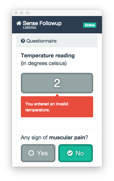
The eHealth theme includes three additional class types to add a small arrow to any side of an alert box, to help make clear what the alert refers to:
These are bootstrap style, so they require three classes to work:
.arrowfor the base styles.arrow-dir-XXfor the direction of the arrow (up,rt,dnorlt).arrow-pos-Xfor the position along the respective edge (t,r,b,lorc), meaning top, right, bottom, left or center (avoid pointless combinations, such asbwithupordn)
The arrow automatically takes on the colour of the alert box.
So the red alert box with an arrow pointing up in the center (from the image above) is:
<div class="alert alert-danger arrow arrow-dir-up arrow-pos-c"></div>
Responsive helper classes for floating elements
Sometimes it is helpful to only pull an element on certain screen sizes. The following helper classes allow to do exactly that:
.pull-right-xsand.pull-left-xs.pull-right-smand.pull-left-sm.pull-right-mdand.pull-left-md.pull-right-lgand.pull-left-lg
In order to have an element be pulled right or left on multiple screen sizes there are additional utility classes defined as follows:
.pull-*-sm-minand.pull-*-sm-max.pull-*-md-minand.pull-*-md-max
So .pull-right-sm-min is basically a shortcut for not having to apply all of
.pull-right-sm, .pull-right-md, and .pull-right-lg together on the same
element.
Add & Remove Margins
These classes add a larger margin of 35px
.more-top
.more-bottom
.more-left
.more-right
These classes add a margin of 15px
.add-top
.add-bottom
.add-left
.add-right
These classes remove any margin
.remove-top
.remove-bottom
.remove-left
.remove-right